Difference between revisions of "User:Elembis/Style"
From The Shartak Wiki
Jump to navigationJump to search (Summarized installation steps for my style of Shartak's CSS.) |
m (Added optional install step for the font "Bitstream Vera Sans".) |
||
| (One intermediate revision by the same user not shown) | |||
| Line 1: | Line 1: | ||
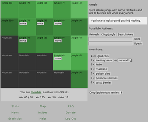
| − | My '''style''' for Shartak changes the appearance of the main game page. To apply my style: | + | [[Image:elembis_style_v1.png|thumb|300px|right|Style version 1 in effect]] |
| + | |||
| + | My '''style''' for Shartak changes the appearance of the main game page. Please leave comments and questions on [[User talk:Elembis/Style]]. | ||
| + | |||
| + | ==Installation== | ||
| + | To apply my style: | ||
#Install [https://addons.mozilla.org/firefox/2108/ Stylish], a Firefox plugin that acts like Greasemonkey for CSS. I'm using version 0.3.2. | #Install [https://addons.mozilla.org/firefox/2108/ Stylish], a Firefox plugin that acts like Greasemonkey for CSS. I'm using version 0.3.2. | ||
| + | #(Optional) Install the [http://www.gnome.org/fonts/ Bitstream Vera] fonts ("Bitstream Vera Sans", specifically). | ||
#Right-click on the Stylish icon in the bottom-right corner of your Firefox window, and select "Manage Styles". Click "Add...". | #Right-click on the Stylish icon in the bottom-right corner of your Firefox window, and select "Manage Styles". Click "Add...". | ||
#Give the style a name ("Elembis style for Shartak") and copy the style's [[User:Elembis/Style/Code|code]] into the text box below. Click "Save". | #Give the style a name ("Elembis style for Shartak") and copy the style's [[User:Elembis/Style/Code|code]] into the text box below. Click "Save". | ||
That's all! Just reload the game window and my style will take effect and stay in effect. (To disable my style at any time, right-click on the Stylish icon while your active window is the Shartak game page and uncheck the checkbox by the name of my style.) | That's all! Just reload the game window and my style will take effect and stay in effect. (To disable my style at any time, right-click on the Stylish icon while your active window is the Shartak game page and uncheck the checkbox by the name of my style.) | ||
| − | + | ==Changes== | |
| + | *Jungle colors have been changed to more soothing tones. Density 10 jungle remains the same color, and less dense jungle is lighter in color (but unchanged in hue and saturation). Density 0 jungle is now light green, not light brown. | ||
| + | *Text for pirates on the map is now light blue, not light red, to distinguish them from outsiders. | ||
| + | *... and more. | ||
| + | |||
| + | In general, my guiding principle was that the things that stand out should be the things you ''want'' to stand out. Many common interface elements appear softer so that event text stands out better; likewise, the borders of map squares have been made much more subtle to help the squares, not their edges, catch your eye. | ||
Latest revision as of 11:16, 23 May 2006
My style for Shartak changes the appearance of the main game page. Please leave comments and questions on User talk:Elembis/Style.
Installation
To apply my style:
- Install Stylish, a Firefox plugin that acts like Greasemonkey for CSS. I'm using version 0.3.2.
- (Optional) Install the Bitstream Vera fonts ("Bitstream Vera Sans", specifically).
- Right-click on the Stylish icon in the bottom-right corner of your Firefox window, and select "Manage Styles". Click "Add...".
- Give the style a name ("Elembis style for Shartak") and copy the style's code into the text box below. Click "Save".
That's all! Just reload the game window and my style will take effect and stay in effect. (To disable my style at any time, right-click on the Stylish icon while your active window is the Shartak game page and uncheck the checkbox by the name of my style.)
Changes
- Jungle colors have been changed to more soothing tones. Density 10 jungle remains the same color, and less dense jungle is lighter in color (but unchanged in hue and saturation). Density 0 jungle is now light green, not light brown.
- Text for pirates on the map is now light blue, not light red, to distinguish them from outsiders.
- ... and more.
In general, my guiding principle was that the things that stand out should be the things you want to stand out. Many common interface elements appear softer so that event text stands out better; likewise, the borders of map squares have been made much more subtle to help the squares, not their edges, catch your eye.
